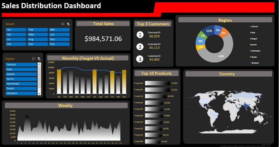
Sales Distribution Dashboard
My Sales Distribution dashboard is a powerful tool designed to help businesses analyze their sales data and make informed decisions.
Built
using Microsoft Excel, this dashboard provides a visually appealing and
easy-to-use interface that allows users to quickly and accurately track
sales performance across multiple products, regions, and time periods.
In this project, I first collect the raw sales data from various sources such as sales records, customer data,
and inventory management systems, and input this data into the excel.
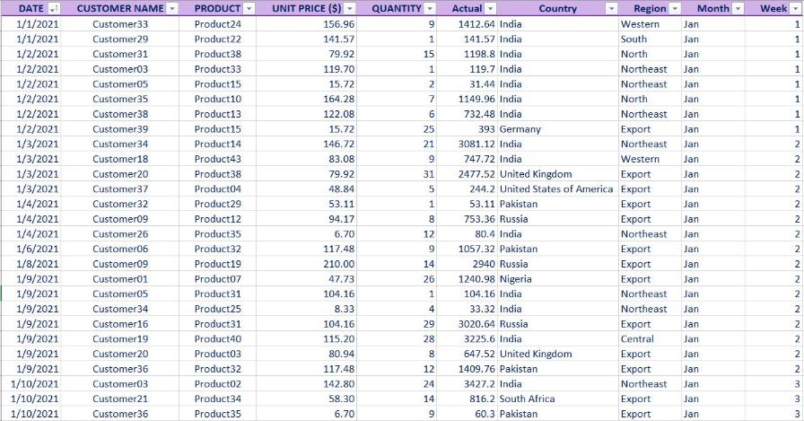
Once the data is collected, it needs to be cleaned and organized to ensure accuracy and consistency.
This involves removing duplicate entries, correcting errors, and standardizing data formats.
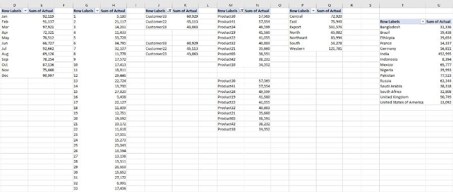
And using pivot tables to summarize and analyze the data we have to generate reports
that provide valuable
insights into sales performance.
Finally, I start building the sales distribution dashboard.
This involves using pivot charts and slicers to create a user-friendly interface that allows you
interact with the data and gain insights at a glance.
Pivot charts allow you to visualize the data in various formats such as bar charts, map graphs, and pie charts,
making it easy to spot trends and patterns in
the data.
Files
You can access this dashboard in my Github Page Here